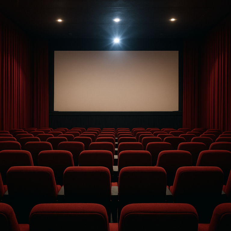
Learning how to design digital posters to promote your online movie event has become an essential skill for film enthusiasts, indie filmmakers, and community organizers who want to build audiences in an increasingly virtual world. The shift toward online screenings, virtual film festivals, and digital watch parties has created unprecedented opportunities for connecting movie lovers across geographic boundaries, but it has also introduced new challenges in capturing attention and conveying the unique atmosphere of a cinematic experience through a static image. The fundamental problem facing anyone promoting an online movie event is differentiation. Social media feeds overflow with visual content competing for milliseconds of attention, while email inboxes filter promotional materials with ruthless efficiency. A poorly designed digital poster not only fails to attract viewers but can actively undermine the credibility of your event.
Conversely, a thoughtfully crafted poster becomes a powerful tool that communicates not just logistical details but the emotional experience awaiting participants. Whether organizing a virtual premiere, a themed movie marathon, or an online film club gathering, the visual identity you establish through your poster sets expectations and builds anticipation. By the end of this article, readers will understand the core principles of effective digital poster design for online movie events, from composition and typography to color psychology and platform optimization. The guidance covers both technical specifications required by various social media platforms and the artistic considerations that transform functional announcements into compelling visual invitations. The techniques discussed apply whether using professional design software, browser-based tools, or mobile applications, making this information accessible regardless of technical background or budget constraints.
Table of Contents
- What Makes an Effective Digital Poster for Promoting Online Movie Events?
- Essential Design Elements for Online Movie Event Promotion
- Platform-Specific Dimensions and Format Requirements for Movie Posters
- How to Create Digital Posters Using Free and Professional Design Tools
- Common Digital Poster Design Mistakes That Undermine Movie Event Promotion
- Building Visual Consistency Across Multi-Event Movie Campaigns
- How to Prepare
- How to Apply This
- Expert Tips
- Conclusion
- Frequently Asked Questions
What Makes an Effective Digital Poster for Promoting Online Movie Events?
An effective digital poster for promoting online movie events must accomplish multiple objectives simultaneously within severe constraints. Unlike physical posters that viewers might encounter in dedicated spaces where attention is already partially committed, digital posters compete in environments designed for rapid scrolling and instant judgment. Research on visual attention patterns indicates that users typically spend between 1.5 and 3 seconds evaluating whether content warrants further engagement, meaning every element of a digital poster must contribute to immediate comprehension and emotional impact.
The hierarchy of information in a movie event poster follows predictable patterns that successful designers exploit consistently. The event title or film name typically occupies the dominant visual position, followed by date and time information, then platform or access details. However, this logical hierarchy must coexist with emotional hierarchy, which prioritizes imagery and mood-setting elements that create the atmospheric promise of the viewing experience. Balancing these competing demands requires understanding that viewers process images approximately 60,000 times faster than text, making the visual foundation of a poster its most critical component.
- **Visual clarity at multiple scales**: Digital posters appear at vastly different sizes depending on platform and device, from full-screen desktop displays to thumbnail previews on mobile feeds. Effective designs maintain legibility and impact across this range.
- **Immediate genre and tone communication**: Within seconds, viewers should understand whether they are looking at a horror movie night, a classic film discussion, or an animated feature screening. Color palettes, typography choices, and imagery work together to establish these expectations.
- **Clear call to action**: Unlike theatrical release posters that simply build awareness, event posters must prompt specific behavior. Registration links, QR codes, or platform information need prominent placement without overwhelming the artistic elements.

Essential Design Elements for Online Movie Event Promotion
Typography selection represents one of the most consequential decisions in digital poster design for movie events, carrying cultural and emotional associations that viewers process subconsciously. Serif fonts typically evoke tradition, sophistication, and classic cinema, making them appropriate choices for retrospective screenings or film noir events. Sans-serif fonts communicate modernity and accessibility, suited to contemporary releases or casual watch parties. Display and decorative fonts can establish specific genre associations, with distressed lettering suggesting horror, geometric styles indicating science fiction, and hand-drawn appearances creating indie or artistic atmospheres.
Color theory applications in movie event posters extend beyond aesthetic preference into psychological territory with documented effects on viewer response. Warm colors like red and orange generate excitement and urgency, valuable for action films or limited-time events. Cool blues and greens create contemplative moods appropriate for dramas or documentary screenings. High contrast between background and text colors ensures legibility, while complementary color schemes create visual tension that attracts attention. The specific palette should ideally reference or complement the film being screened, creating visual consistency between the promotional material and the viewing experience itself.
- **Negative space utilization**: Crowded designs overwhelm viewers and reduce information retention. Strategic empty space directs attention toward critical elements and improves overall readability.
- **Image quality standards**: Digital posters require minimum resolutions of 150 PPI for web display, with higher resolutions for platforms that support zooming or printing. Pixelated or compressed images immediately signal amateur production values.
- **Consistent branding elements**: For recurring events or established organizations, incorporating recognizable logos, color schemes, or design motifs builds cumulative brand recognition across multiple promotions.
Platform-Specific Dimensions and Format Requirements for Movie Posters
Technical specifications vary dramatically across the platforms where digital movie event posters typically appear, requiring either multiple versions of each design or strategic compromise on a single versatile format. Instagram favors square images at 1080 x 1080 pixels for feed posts, while Stories and Reels require vertical 1080 x 1920 pixel formats. Facebook event covers use a 16:9 aspect ratio at 1920 x 1080 pixels, appearing differently on desktop and mobile interfaces. Twitter displays images at a 2:1 ratio optimally, cropping taller images unpredictably in timeline views.
File format selection affects both visual quality and platform compatibility. PNG files preserve sharp edges and text clarity, making them ideal for graphics-heavy designs with solid colors and typography. JPEG files offer smaller file sizes suitable for photographic images but introduce compression artifacts around text and geometric shapes. Some platforms now support WebP format, which provides superior compression without quality loss, though compatibility varies. Animated GIF or video formats offer additional engagement potential on platforms that autoplay motion content, though they require significantly more production effort.
- **Safe zone planning**: Critical information should remain within the central 80 percent of any design to account for varying crop behaviors across platforms and devices.
- **File size optimization**: Most platforms compress uploaded images regardless of original quality. Starting with appropriately sized files (typically 1-5 MB for static images) prevents double compression that degrades appearance.
- **Accessibility considerations**: Alt text capabilities on major platforms allow adding descriptions that make posters accessible to visually impaired users and improve search discoverability.

How to Create Digital Posters Using Free and Professional Design Tools
The democratization of graphic design tools has made professional-quality digital poster creation accessible to virtually anyone with internet access. Canva offers the most approachable entry point, providing thousands of movie-themed templates, drag-and-drop functionality, and a library of stock images and fonts within its free tier. The platform handles technical specifications automatically, with preset dimensions for major social platforms and one-click resizing between formats. For those requiring more control, Adobe Express provides similar accessibility with deeper integration into the Adobe ecosystem.
Professional software options deliver greater precision at the cost of steeper learning curves. Adobe Photoshop remains the industry standard for image manipulation and complex composite designs, while Adobe Illustrator excels at vector-based graphics that scale infinitely without quality loss. Affinity Designer and Photo offer comparable capabilities at one-time purchase prices rather than subscription models. Open-source alternatives like GIMP and Inkscape provide powerful functionality without cost, supported by extensive tutorial communities and plugin ecosystems.
- **Template modification versus original creation**: Beginning with templates accelerates production but risks generic results if modifications remain superficial. Effective template use involves significant customization of colors, fonts, and layouts rather than simple text replacement.
- **Layer organization**: Complex designs benefit from logical layer naming and grouping, facilitating revisions and enabling export of multiple versions for different platforms from a single source file.
- **Asset sourcing**: Stock photo services like Unsplash, Pexels, and Pixabay provide royalty-free images, though popular images may appear across multiple unrelated projects. Original photography or commissioned illustration ensures uniqueness.
Common Digital Poster Design Mistakes That Undermine Movie Event Promotion
Information overload represents the most frequent failure mode in amateur digital poster design, stemming from understandable anxiety about omitting necessary details. Event organizers attempting to include complete schedules, extensive film synopses, sponsor acknowledgments, and multiple contact methods create visual chaos that repels rather than attracts attention. The solution involves recognizing that a poster serves as a gateway rather than a comprehensive information source, enticing viewers to seek additional details through linked platforms or registration pages. Typography errors compound communication failures in ways that undermine even strong conceptual designs.
Using more than two or three font families creates visual discord, while insufficient contrast between text and background renders information illegible. Centered text alignment for lengthy passages creates ragged, difficult-to-read shapes, and justified alignment introduces awkward spacing. Tracking adjustments that compress or expand letter spacing beyond reasonable limits distort letterforms and slow reading speed. All-caps text in body copy creates visual monotony and actually reduces legibility compared to sentence case.
- **Resolution and scaling failures**: Designing at small dimensions then enlarging for final output introduces pixelation that cannot be corrected. Always work at final output resolution or larger.
- **Inconsistent visual language**: Mixing photographic and illustrated elements, or combining incompatible stylistic approaches, creates cognitive dissonance that confuses viewers about event tone and quality expectations.
- **Neglecting mobile preview**: Designing exclusively on desktop monitors without checking mobile appearance leads to text too small to read on phone screens, the primary viewing context for most social media content.

Building Visual Consistency Across Multi-Event Movie Campaigns
Organizations hosting recurring online movie events benefit enormously from establishing visual systems that create recognition across individual promotions. A coherent design system includes defined color palettes with primary, secondary, and accent colors; approved typography pairings for headlines and body text; consistent logo placement and sizing; and standardized approaches to imagery style. These constraints actually accelerate production of individual pieces while building cumulative brand equity.
Template libraries specific to recurring events enable rapid production without sacrificing quality. Creating master templates for each platform, with locked elements for consistent branding and editable areas for event-specific information, ensures visual continuity while allowing necessary customization. Documenting these standards in a simple style guide prevents drift over time, particularly valuable when multiple people contribute to promotional efforts or when revisiting designs after extended breaks between events.
How to Prepare
- **Gather all essential information first**: Compile the event title, date and time with timezone specification, platform information, registration or access links, and any sponsor or partner logos. Attempting to add forgotten elements after design completion often disrupts carefully balanced compositions.
- **Research visual references and inspiration**: Examine posters for similar events and theatrical releases in related genres. Screenshot examples that resonate, analyzing what specific elements create their impact. This reference collection guides decision-making throughout the design process without requiring direct imitation.
- **Determine distribution channels and their requirements**: List every platform where the poster will appear and document the specific dimension and format requirements for each. Deciding whether to create multiple tailored versions or a single compromise design affects initial composition choices.
- **Assess available visual assets**: Inventory existing images, logos, and graphics that might contribute to the design. Identify gaps requiring stock image sourcing, original creation, or commissioning. Confirm licensing terms for any third-party assets.
- **Define success metrics and approval workflow**: Establish how effectiveness will be measured, whether through registration conversions, social engagement, or simple distribution targets. Clarify who must approve the final design and what revision capacity exists in the timeline.
How to Apply This
- **Start with composition and hierarchy**: Block out the major elements of your design at actual size before adding final content. Position primary, secondary, and tertiary information zones, establishing visual flow that guides the eye through the design in intended order.
- **Select and refine your color palette**: Choose colors that reflect event tone while ensuring sufficient contrast for legibility. Test palette selections against both light and dark viewing environments, as screen settings vary dramatically across devices.
- **Apply typography systematically**: Set your text with consistent size relationships between hierarchy levels. Preview at actual display size on multiple devices, adjusting sizing to ensure readability at the smallest expected viewing dimension.
- **Export platform-specific versions**: Generate final files for each distribution channel at appropriate dimensions and formats. Verify that no critical information falls into crop zones and that file sizes meet platform requirements for optimal quality preservation.
Expert Tips
- **Design for the thumbnail first**: Before finalizing any poster, reduce it to the size it will appear in social media feeds and verify that essential information remains legible and the overall composition maintains impact at that scale.
- **Use the blur test for composition evaluation**: Apply a gaussian blur to your design and examine whether the major shapes and contrast areas create a compelling abstract composition. Strong designs maintain visual interest even without readable details.
- **Leverage color associations from the film itself**: Pull palette colors directly from key frames of the movie being promoted to create inherent visual harmony between the poster and the viewing experience it advertises.
- **Build urgency through design, not just copy**: Diagonal compositions, contrasting colors, and asymmetrical balance create psychological tension that communicates urgency more effectively than exclamation points or phrases like “Don’t miss it.”
- **Test on actual target audiences before finalizing**: Share draft designs with three to five representatives of your intended audience and gather specific feedback on what they notice first, what information they retain, and whether the overall impression matches your intentions.
Conclusion
The skills required to design effective digital posters for online movie events combine technical knowledge with artistic sensibility in ways that reward both study and practice. Understanding platform specifications, typography principles, color psychology, and composition fundamentals provides the foundation, but applying these concepts successfully requires iteration and feedback. Each poster created becomes an opportunity to refine technique and develop personal style that distinguishes your events from countless competing demands for audience attention.
The visual identity established through thoughtful poster design extends beyond individual events to shape perceptions of organizers and communities. Consistently excellent promotional materials signal care and professionalism that transfers to expectations about the events themselves, building audience trust that converts casual interest into committed attendance. As online movie events continue evolving as a permanent feature of film culture, the ability to create compelling visual invitations becomes not merely useful but essential for anyone seeking to share cinematic experiences with audiences beyond their immediate physical reach.
Frequently Asked Questions
How long does it typically take to see results?
Results vary depending on individual circumstances, but most people begin to see meaningful progress within 4-8 weeks of consistent effort.
Is this approach suitable for beginners?
Yes, this approach works well for beginners when implemented gradually. Starting with the fundamentals leads to better long-term results.
What are the most common mistakes to avoid?
The most common mistakes include rushing the process, skipping foundational steps, and failing to track progress.
How can I measure my progress effectively?
Set specific, measurable goals at the outset and track relevant metrics regularly. Keep a journal to document your journey.