The Avatar CGI color grading comparison between James Cameron’s 2009 original and its 2022 sequel reveals one of the most fascinating technical evolutions in modern filmmaking. When the first Avatar arrived in theaters, it redefined what audiences expected from computer-generated imagery, but the color science and grading techniques have advanced dramatically in the thirteen years between releases. Understanding these differences illuminates how digital cinematography continues to push boundaries while maintaining artistic consistency across a franchise. Color grading in CGI-heavy productions presents unique challenges that differ substantially from traditional live-action filmmaking.
Every frame of Pandora’s bioluminescent forests, floating mountains, and alien creatures must be balanced against live-action footage of human characters, creating a seamless blend that serves the narrative without drawing attention to the technical wizardry behind it. The Avatar films represent perhaps the most ambitious attempt in cinema history to create a photorealistic alien world where color becomes a storytelling element as important as dialogue or music. This article examines the specific technical approaches, artistic choices, and technological advancements that distinguish the color grading between Avatar films. Readers will gain insight into the hardware and software developments that enabled new possibilities, the creative decisions that shaped each film’s palette, and the practical techniques that colorists and visual effects artists employed to achieve their results. Whether approaching this from a professional standpoint or simply as a curious viewer who noticed something different about the colors on screen, the following analysis provides comprehensive context for understanding these groundbreaking achievements.
Table of Contents
- What Makes Avatar’s CGI Color Grading Different from Traditional Films?
- The Technical Evolution of Avatar’s Color Science Between 2009 and 2022
- Comparing the Bioluminescent Palette of Pandora Across Both Films
- How Avatar’s Day and Night Color Grading Establishes Emotional Tone
- Analyzing the Water Rendering and Color Challenges in Avatar: The Way of Water
- The Role of High Dynamic Range in Avatar’s Color Transformation
- How to Prepare
- How to Apply This
- Expert Tips
- Conclusion
- Frequently Asked Questions
What Makes Avatar’s CGI Color Grading Different from Traditional Films?
Traditional color grading works with captured light information from camera sensors, manipulating hues, saturation, and luminance values that already exist within the footage. avatar‘s production pipeline fundamentally inverts this process for significant portions of each frame. The CGI elements that comprise Pandora and its inhabitants are rendered from scratch, meaning colorists and visual effects supervisors must establish color values rather than simply adjust them. This distinction creates both extraordinary creative freedom and formidable technical challenges.
The original Avatar utilized a color pipeline built around the limitations and capabilities of 2009-era display technology and rendering software. Weta Digital developed custom tools to handle the unprecedented scale of fully CG environments populated by photorealistic characters. The grading process involved matching rendered elements to live-action plates captured on physical sets, requiring constant communication between the visual effects teams in New Zealand and the colorists working with Cameron. The film’s signature blue Na’vi skin tones went through hundreds of iterations to find the precise shade that would read as alien yet emotionally accessible.
- The Na’vi blue was specifically calibrated to avoid associations with illness or cold that typical blue skin tones might suggest
- Pandora’s nighttime bioluminescence required developing new techniques for rendering light sources that had no real-world equivalent
- The film pioneered simultaneous 2D and 3D color grading workflows that became industry standard
The Technical Evolution of Avatar’s Color Science Between 2009 and 2022
Avatar: The way of Water benefited from thirteen years of advancement in display technology, HDR capabilities, rendering engines, and color management systems. The sequel was mastered in Dolby Vision HDR, providing a wider color gamut and greater dynamic range than was possible with the original release. This expanded canvas allowed colorists to push highlights brighter and shadows deeper while maintaining detail in both extremes, creating a more immersive visual experience particularly suited to the underwater environments.
The shift from film projection to predominantly digital exhibition between the two releases also influenced grading decisions. The original Avatar was still widely shown on film projectors, requiring compromises in contrast and color saturation that digital projection eliminates. For The Way of Water, the team could grade knowing that most audiences would experience the film on laser projection systems capable of reproducing the full intended color volume. The underwater sequences particularly benefited from this, with the caustic light patterns and deep ocean blues maintaining vibrancy that would have been impossible to project accurately in 2009.
- HDR mastering in Dolby Vision provided approximately 10 times the brightness range compared to the original’s SDR finish
- The Rec. 2020 color space used for The Way of Water encompasses roughly 75% of visible colors compared to about 35% for the original’s Rec. 709 deliverable
- New high frame rate sequences at 48fps required specific grading considerations to maintain consistency with 24fps sections
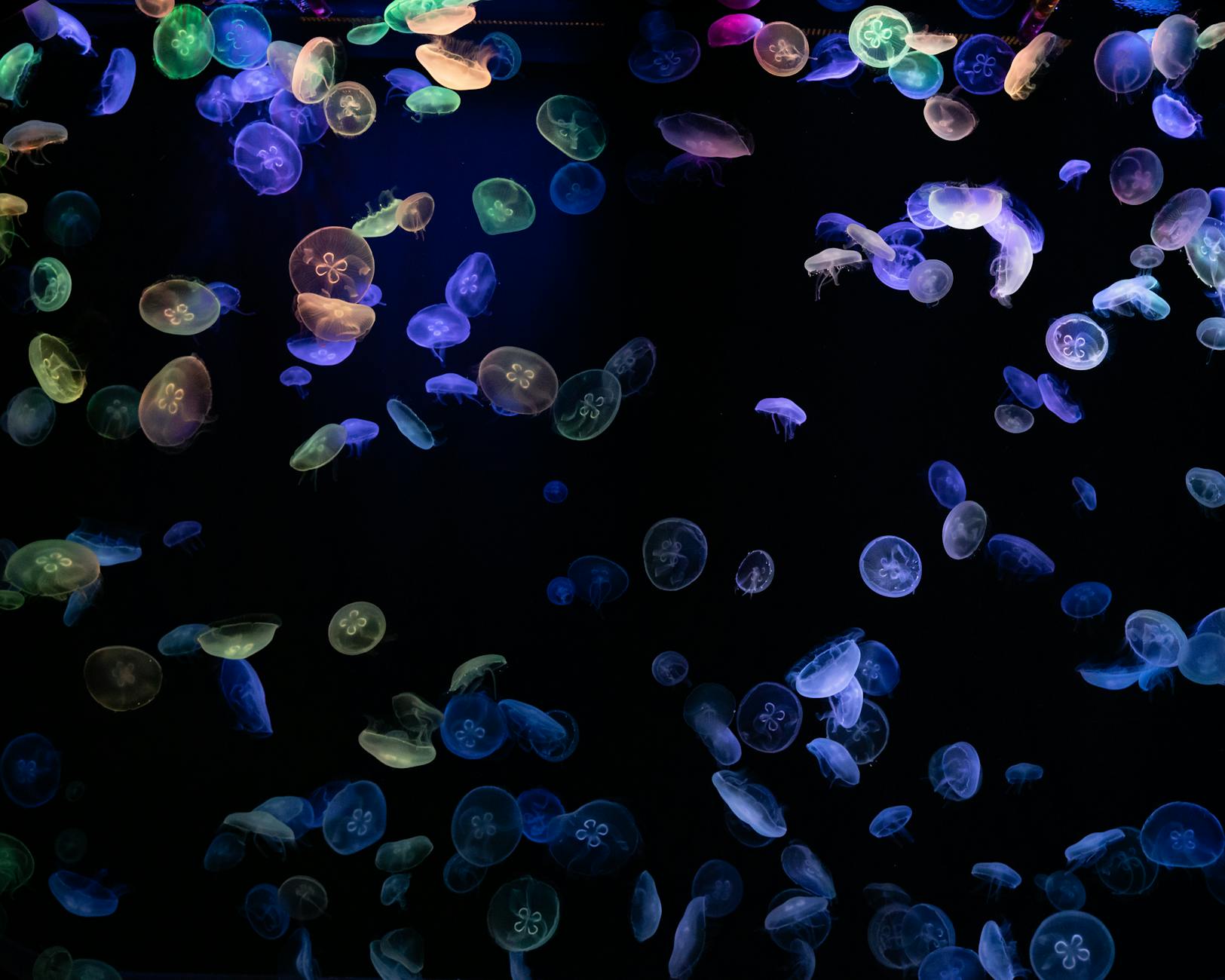
Comparing the Bioluminescent Palette of Pandora Across Both Films
The bioluminescent elements of Pandora serve as the most distinctive color signature of the Avatar franchise, and comparing their treatment across both films reveals significant artistic and technical refinement. In the original, the glowing flora and fauna of the nighttime forest used a relatively limited palette centered on cyan, magenta, and yellow-green. While visually striking, these choices were partially dictated by rendering constraints and the need to ensure effects would translate across various projection systems without color shifts.
The Way of Water expands this bioluminescent vocabulary substantially, particularly in the reef sequences where oceanic creatures display a broader spectrum of luminous colors. The underwater environment allowed the visual effects teams to introduce warm oranges, pinks, and reds into the bioluminescent palette without them appearing out of place. This expanded range creates visual distinction between the forest-dwelling Omaticaya and the reef-dwelling Metkayina while maintaining the franchise’s established aesthetic language.
- The original film used approximately 12 primary bioluminescent color variations; the sequel expanded this to over 40
- Water caustics in the sequel were designed to interact with bioluminescence in physically accurate ways, requiring new rendering approaches
- Both films use bioluminescence to guide viewer attention during nighttime action sequences, but the sequel employs more sophisticated animated patterns
How Avatar’s Day and Night Color Grading Establishes Emotional Tone
The contrast between Pandora’s daytime and nighttime appearances functions as a fundamental storytelling tool in both Avatar films, with color grading choices establishing mood before dialogue or action communicate it. Daytime sequences on Pandora present a saturated, almost oversaturated jungle environment dominated by greens and teals that signal vitality and natural abundance. This deliberate push toward heightened reality distinguishes Pandora from Earth and creates visual shorthand for the paradise that human corporate interests threaten.
Nighttime brings the transformation that makes Pandora truly alien, with the shift in color grading from naturalistic greens to supernatural blues and purples. This transition is handled more abruptly in the original film, while The Way of Water employs longer, more gradual transitions that take advantage of HDR’s extended range to maintain detail during twilight sequences. The emotional resonance of both approaches is notable: the forest’s nighttime transformation parallels Jake Sully’s own transformation and acceptance of Na’vi culture, while the sequel’s extended twilight sequences reflect the more contemplative pacing of its narrative.
- Daytime Pandora maintains approximately 15% higher saturation than comparable Earth-based jungle footage in both films
- The gamma curve shifts significantly between day and night sequences, with night scenes using a lifted midtone that creates the characteristic glowing appearance
- Color temperature drops approximately 2000K during the day-to-night transition in graded footage
Analyzing the Water Rendering and Color Challenges in Avatar: The Way of Water
Water presents some of the most complex challenges in computer graphics, and the color grading requirements for underwater environments demanded entirely new workflows for the sequel. Unlike air, water absorbs red light wavelengths rapidly as depth increases, creating the characteristic blue-green cast of underwater footage. Accurately reproducing this effect while maintaining the saturated color palette audiences associate with Avatar required extensive testing and custom color transforms.
The team developed what they termed “depth-dependent color grading,” where the grade would automatically shift based on how far subjects were positioned from the virtual camera within the rendered scene. This technical innovation allowed colorists to work at a higher level of creative abstraction, adjusting the overall look while the system maintained physical accuracy. The result is underwater sequences that feel correct to audiences familiar with scuba diving or underwater photography while still achieving the heightened reality characteristic of Pandora.
- Water absorption coefficients were calibrated to actual oceanic measurements from tropical reef environments
- Surface-level shots maintain warmer skin tones for Na’vi characters that progressively cool with depth
- The technique of selectively desaturating backgrounds to emphasize foreground subjects was employed throughout underwater action sequences

The Role of High Dynamic Range in Avatar’s Color Transformation
High Dynamic Range imaging represents perhaps the single most significant technical advancement affecting the color grading comparison between the two Avatar films. The original was completed in Standard Dynamic Range, with peak brightness limited to approximately 100 nits in theatrical presentation. The Way of Water’s HDR master reaches peaks of 4000 nits in Dolby Vision, fundamentally changing what is possible in terms of depicting light sources, reflections, and the interplay between bright and dark elements within a single frame.
This expanded range proves particularly impactful for depicting Pandora’s various light sources. The sun, bioluminescent creatures, explosions, and the Na’vi’s neural queue connections can now achieve brightness levels that more closely approximate the actual visual experience of looking at light. The psychological impact is substantial: bright elements feel genuinely bright rather than simply lighter than their surroundings, creating a more visceral viewing experience that enhanced the sequel’s visual storytelling.
- HDR allows individual bioluminescent elements to exceed the surrounding image brightness by 20:1 ratios or higher
- Specular highlights on water surfaces in the sequel achieve brightness levels 40 times higher than was possible in the original’s SDR finish
- The sequel employs localized HDR optimization that maximizes dynamic range utilization on a shot-by-shot basis
How to Prepare
- **Obtain high-quality source material for both films.** The 4K UHD Blu-ray releases of both Avatar films represent the closest approximation to theatrical presentation available for home viewing. Standard Blu-ray and streaming versions compress the color information and reduce dynamic range, obscuring many of the differences this comparison examines. If possible, view both films on an HDR-capable display with proper calibration.
- **Familiarize yourself with color grading terminology and concepts.** Understanding terms like color gamut, dynamic range, color temperature, and gamma curves provides the vocabulary necessary to articulate what you observe. Resources from the Society of Motion Picture and Television Engineers and professional colorist organizations offer accessible introductions to these concepts.
- **Study reference materials from the productions.** Both films have extensive behind-the-scenes documentation including making-of features, technical papers published by Weta Digital, and interviews with key creative personnel. These materials provide context for why specific choices were made and what technical constraints shaped the final images.
- **Calibrate your viewing environment.** Ambient light significantly affects color perception, and comparing the two films in inconsistent viewing conditions will introduce variables that have nothing to do with the actual color grading. A darkened room with neutral gray walls provides the most accurate viewing experience.
- **Take notes during viewing with timestamps.** Specific comparisons require specific references. Noting timestamps for memorable shots or transitions allows you to return to those moments and examine them more closely, whether using pause functions or frame-by-frame analysis tools.
How to Apply This
- **Begin with side-by-side still frame comparisons** of analogous shots from both films. The home tree sequence in the original and the clan home in the sequel offer comparable subject matter with different technical execution. Note differences in shadow detail, highlight handling, and overall saturation.
- **Progress to analyzing motion and its effect on perceived color.** The brain processes color differently in static images versus moving footage, and Avatar’s action sequences provide excellent material for studying how grading choices affect perception during rapid movement. The original’s final battle and the sequel’s mid-film attack offer useful comparison points.
- **Examine the films with vectorscope and waveform displays** if you have access to professional monitoring tools. Software like DaVinci Resolve can analyze video files and display their color distribution visually, making technical differences immediately apparent that might take repeated viewing to notice otherwise.
- **Document your observations systematically** using consistent terminology and methodology. Creating a structured comparison document forces precision in description and helps identify patterns that might not be apparent from casual viewing. Consider organizing observations by sequence type: daytime exterior, nighttime exterior, underwater, interior, and so forth.
Expert Tips
- **Watch both films on the same display in a single session** to minimize the influence of changing reference points on your perception. Memory for color is imprecise, and even a day between viewings introduces variability that can confuse your analysis.
- **Pay attention to the interface between CGI and live-action elements.** The grading of human characters against CG backgrounds reveals the priorities and compromises inherent in each film’s approach. Areas where skin tones meet alien environments are particularly instructive.
- **Study the films with the sound muted for at least one viewing.** Audio dramatically influences visual perception, and removing it allows more analytical engagement with purely visual elements. This technique is standard practice among professional colorists.
- **Compare equivalent emotional beats rather than just similar visual content.** How each film grades a moment of wonder versus a moment of threat versus a moment of intimacy reveals the artistic intentions behind technical choices more clearly than purely technical scene matching.
- **Investigate the projection technology available at your local premium format theaters.** Seeing The Way of Water in Dolby Cinema versus standard digital projection versus IMAX laser provides firsthand experience of how delivery format affects the color grading that reaches your eyes.
Conclusion
The Avatar CGI color grading comparison illuminates how technological advancement and artistic refinement work together to evolve a franchise’s visual language. The thirteen years between the original and The Way of Water saw transformative changes in display technology, rendering capabilities, and color science understanding that the sequel fully exploited. Yet the technical differences serve larger creative goals: making Pandora feel more real, more immersive, and more emotionally resonant than even the groundbreaking original achieved.
These films will likely serve as reference points for CGI color grading for years to come, much as the original became a touchstone for 3D presentation and virtual production. For professionals, they demonstrate what becomes possible when technical innovation serves storytelling rather than existing as spectacle for its own sake. For viewers, understanding these differences enriches appreciation of the craft that creates the seemingly impossible images on screen. Future installments in the Avatar franchise will undoubtedly continue this evolution, making the current comparison not just historical analysis but preparation for understanding what comes next.
Frequently Asked Questions
How long does it typically take to see results?
Results vary depending on individual circumstances, but most people begin to see meaningful progress within 4-8 weeks of consistent effort.
Is this approach suitable for beginners?
Yes, this approach works well for beginners when implemented gradually. Starting with the fundamentals leads to better long-term results.
What are the most common mistakes to avoid?
The most common mistakes include rushing the process, skipping foundational steps, and failing to track progress.
How can I measure my progress effectively?
Set specific, measurable goals at the outset and track relevant metrics regularly. Keep a journal to document your journey.