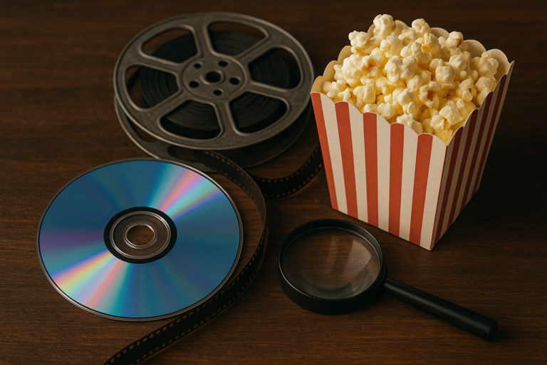
The landscape of unique visual styles in indie horror cinema has expanded dramatically over the past two decades, giving audiences some of the most inventive and unsettling imagery ever committed to film. While major studio horror productions often rely on polished cinematography and familiar visual tropes, independent filmmakers have carved out a distinct space by experimenting with everything from found footage aesthetics to hypnotic color palettes that transform modest budgets into artistic statements. These visual innovations have not only redefined what horror can look like but have also influenced mainstream filmmaking in ways that continue to ripple through the industry. Understanding these distinctive visual approaches matters for anyone who appreciates horror as a cinematic art form rather than merely a vehicle for jump scares.
Independent horror directors face a fundamental challenge: how do you create dread, atmosphere, and visceral impact without the resources available to larger productions? The answer, repeatedly proven by filmmakers from David Lynch to Robert Eggers, lies in developing a strong visual identity that serves the story’s emotional and thematic needs. This resourcefulness has produced some of the genre’s most memorable images and has demonstrated that creative vision often trumps financial backing. By the end of this article, readers will have a comprehensive understanding of fifteen distinct visual styles that have shaped indie horror, from the grainy textures of lo-fi filmmaking to the meticulously composed frames of art-house terror. Each style represents not just an aesthetic choice but a philosophical approach to how horror can affect viewers psychologically and emotionally. Whether you are a filmmaker looking for inspiration, a horror enthusiast seeking deeper appreciation, or a casual viewer curious about why certain films look the way they do, this exploration will illuminate the craft behind the scares.
Table of Contents
- What Makes Visual Style Essential to Indie Horror Cinema?
- Found Footage and Faux Documentary Visual Approaches in Horror
- Retro Analog Aesthetics and Period-Accurate Visual Design
- Practical Techniques for Creating Lo-Fi and Grindhouse Horror Visuals
- Art House Horror and the Challenge of Elevated Visual Composition
- Neon-Soaked and Hypersaturated Color Design in Modern Indie Horror
- How to Prepare
- How to Apply This
- Expert Tips
- Conclusion
- Frequently Asked Questions
What Makes Visual Style Essential to Indie Horror Cinema?
Visual style in indie horror serves a fundamentally different purpose than in mainstream productions. When budgets cannot support elaborate special effects or expensive set pieces, the cinematographic approach becomes the primary tool for generating fear and unease. Directors must rely on composition, lighting, color grading, and camera movement to create psychological tension that compensates for””and often surpasses””what money could buy. This necessity has birthed some of cinema’s most innovative visual languages.
The relationship between limited resources and visual creativity follows a consistent pattern throughout horror history. The German Expressionist movement of the 1920s established this template, using painted shadows and distorted architecture because filmmakers could not afford realistic sets. Modern indie horror continues this tradition: the found footage movement emerged partly because handheld consumer cameras were cheap and accessible. What began as pragmatic solutions evolved into aesthetic movements with their own grammar and conventions.
- **Atmosphere over spectacle**: Indie horror visual styles prioritize sustained mood rather than momentary shock, using consistent visual motifs to build cumulative dread
- **Viewer participation**: Many styles deliberately obscure or suggest rather than show, requiring audiences to fill in horrific details with their imagination
- **Thematic reinforcement**: Visual choices often mirror narrative themes””grimy textures for stories about decay, antiseptic brightness for tales of institutional horror
Found Footage and Faux Documentary Visual Approaches in Horror
The found footage style revolutionized indie horror economics and aesthetics when “The Blair Witch Project” demonstrated in 1999 that a film shot on consumer video could gross nearly $250 million worldwide. This visual approach simulates amateur or documentary footage, typically featuring shaky handheld camerawork, naturalistic lighting, and deliberate technical imperfections. The style’s power lies in its suggestion of authenticity””viewers process the images as if they might be witnessing real events rather than staged fiction. Several variations have emerged within this broad category.
Pure found footage films like “Paranormal Activity” present unedited recordings supposedly discovered after tragic events. Mockumentary horror such as “Lake Mungo” adopts the conventions of investigative documentaries, complete with talking-head interviews and archival material. Screen life horror like “Host” and “Unfriended” restricts the visual field to computer screens and video calls, reflecting contemporary digital existence. Each variation exploits different aspects of how we consume and trust visual media.
- **Technical authenticity**: Successful found footage requires deliberate degradation””dropped frames, autofocus hunting, audio distortion””that paradoxically demands careful craftsmanship
- **Limited perspective**: The camera operator’s restricted viewpoint creates natural suspense because viewers cannot see what lurks outside the frame
- **Breaking the fourth wall**: The acknowledgment of the camera’s presence fundamentally changes the horror dynamic, making viewers complicit observers
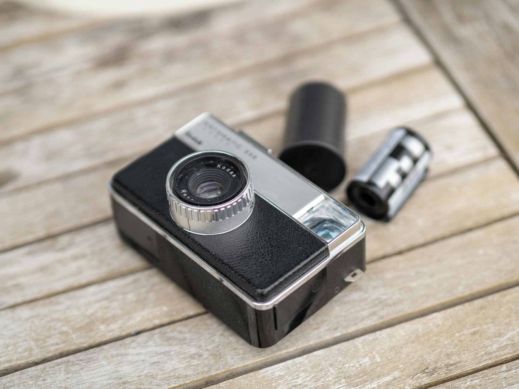
Retro Analog Aesthetics and Period-Accurate Visual Design
A significant strand of indie horror has embraced deliberate anachronism, recreating the visual textures of past decades with meticulous attention to period-accurate filmmaking techniques. This approach extends beyond mere nostalgia to tap into the psychological associations viewers hold with different eras of cinema. The grain structure of 16mm film, the color shifts of aged prints, and the optical effects of vintage lenses all carry emotional weight that digital clarity cannot replicate.
Films like “The House of the Devil” and “Beyond the Black Rainbow” exemplify this commitment to analog recreation. Ti West shot his 2009 film on 16mm with vintage Panavision lenses, replicating the look of early 1980s horror down to the opening titles and freeze-frame credits. Panos Cosmatos went further with “Beyond the Black Rainbow,” spending years in post-production to achieve the specific chromatic aberrations and diffusion effects of 1970s and 1980s science fiction horror. These choices reflect an understanding that visual texture communicates era, mood, and meaning simultaneously.
- **Format-specific characteristics**: Super 8, 16mm, 35mm, and early video formats each possess distinct grain patterns, color responses, and motion qualities
- **Optical versus digital**: Period lenses produce different flare patterns, bokeh shapes, and edge softness than modern glass, contributing to authentic period recreation
- **Cultural memory**: Audiences who grew up watching horror on VHS or late-night television carry visceral associations with those formats’ visual degradation
Practical Techniques for Creating Lo-Fi and Grindhouse Horror Visuals
The grindhouse revival in indie horror draws inspiration from the exploitation cinema of the 1960s and 1970s, embracing the imperfections that characterized films produced quickly and cheaply for drive-ins and urban theaters. This visual style celebrates rather than disguises its low-budget origins, transforming production limitations into aesthetic features. Scratches, splices, color fading, and missing frames become part of the viewing experience rather than flaws to be corrected.
Achieving authentic lo-fi visuals requires understanding both the technical causes of vintage film degradation and the emotional responses these artifacts trigger. Modern filmmakers employ various techniques: shooting on actual film stock and degrading it physically, applying digital filters that simulate specific types of damage, or combining approaches to achieve particular effects. The key lies in specificity””random noise looks artificial, while historically accurate degradation patterns register as genuine to viewers familiar with the source material.
- **Practical scratching**: Some filmmakers physically damage prints or negatives, dragging them across abrasive surfaces or exposing them to chemical agents
- **Digital aging plugins**: Software tools can simulate projector burns, vinegar syndrome color shifts, and sprocket damage with increasing accuracy
- **Sound design integration**: Visual degradation must match audio quality; pristine sound with damaged visuals breaks the illusion immediately
- **Selective application**: The most effective grindhouse homages apply degradation inconsistently, mimicking how actual prints deteriorated unevenly through handling
Art House Horror and the Challenge of Elevated Visual Composition
The emergence of so-called “elevated horror” or art-house horror has brought painterly composition and deliberate pacing to independent genre filmmaking. Directors like Ari Aster, Robert Eggers, and Jennifer Kent have created visually dense films where every frame operates on multiple levels””establishing setting, conveying psychological states, and embedding symbolic meaning. This approach demands viewers engage actively with visual information rather than passively receiving narrative.
The visual hallmarks of art-house indie horror include extended static shots, symmetrical composition, and carefully controlled color palettes. “The Witch” employs natural lighting and muted earth tones to create authenticity while using compositional techniques borrowed from seventeenth-century Dutch painting. “Hereditary” uses architectural framing to suggest dollhouse artificiality, reinforcing themes of manipulation and predetermined fate. These films prove that horror need not sacrifice aesthetic sophistication to achieve visceral impact.
- **Negative space**: Art-house horror frequently uses empty areas of the frame to create unease, suggesting presences that might enter at any moment
- **Tableau staging**: Actors arranged in static, theatrical compositions create distance that amplifies horror by denying viewers the comfort of identification
- **Long take tension**: Extended shots without cuts force audiences to scan the frame for threats, transforming them into active participants in their own frightening
Neon-Soaked and Hypersaturated Color Design in Modern Indie Horror
A vibrant counter-tradition to muted, realistic horror has emerged through filmmakers who embrace aggressive, non-naturalistic color design. This neon-drenched aesthetic owes debts to Italian giallo cinema, particularly the work of Dario Argento and Mario Bava, while incorporating contemporary influences from music videos, video games, and digital art. Films bathed in magenta, cyan, and electric blue reject the assumption that horror must be dark and desaturated.
Nicolas Winding Refn’s influence looms large over this visual territory, with “The Neon Demon” establishing a template that subsequent indie horror has explored and expanded. Panos Cosmatos continued this trajectory with “Mandy,” a film that abandons chromatic naturalism entirely in its second half, saturating frames in blood reds and alien purples. This style operates through sensory overwhelm rather than atmospheric suggestion, inducing altered states in viewers through sheer visual intensity.
- **Gel lighting**: Colored gels on practical light sources create in-camera effects that maintain consistency and react naturally with environments
- **Post-production grading**: Digital color correction allows precise control over specific hues, enabling filmmakers to push particular colors while maintaining others
- **Symbolic color systems**: Many neon horror films assign narrative meaning to colors, using shifts in palette to signal psychological or supernatural transitions
How to Prepare
- **Study historical references exhaustively**: Before settling on a visual style, watch films that employed similar approaches and analyze specifically how they achieved their effects. Take notes on lighting setups, lens choices, color palettes, and camera movement. Understanding precedents helps you either faithfully recreate established styles or deliberately subvert them.
- **Create comprehensive visual reference boards**: Compile images from films, paintings, photographs, and other sources that capture elements of your intended visual approach. Organize these references by category””lighting, color, composition, texture””and share them with your cinematographer, production designer, and colorist to ensure unified vision.
- **Conduct extensive camera and lens tests**: Different camera sensors and lenses produce dramatically different results. Test your specific equipment in conditions matching your shooting environment, paying attention to how various ISO settings, apertures, and color temperatures interact with your intended style.
- **Develop detailed lighting plots**: Document your intended lighting approach for key scenes, including practical light sources, fixture types, gel colors, and intensity levels. This preparation accelerates on-set work and ensures consistency across shooting days.
- **Establish color grading parameters early**: Work with your colorist before production to define the parameters of your final look. Creating preliminary grades for test footage helps identify what you can achieve in post-production versus what must be captured in-camera.
How to Apply This
- **Maintain reference materials on set**: Keep visual references accessible during shooting so every department can verify their work aligns with established style. Display reference images on monitors and distribute printed lookbooks to key crew members.
- **Capture technical data for every setup**: Record detailed information about each lighting configuration, camera setting, and lens choice. This documentation proves invaluable when matching shots, reshooting material, or replicating your approach on future projects.
- **Review dailies with style consistency as primary criterion**: When evaluating each day’s footage, prioritize visual consistency over performance or coverage concerns. Technical variations are often easier to fix than stylistic inconsistencies.
- **Build post-production workflows around your style**: Configure your editing and grading software to support your intended look from the start. Create LUTs (lookup tables) and preset configurations that apply your base grade immediately, allowing you to evaluate cuts with final color in mind.
Expert Tips
- **Embrace practical effects within your visual framework**: Physical effects often integrate more seamlessly into stylized visuals than digital additions. Atmospheric elements like fog, rain, and dust interact naturally with your lighting design while adding texture that enhances low-budget production value.
- **Use visual style to compensate for performance limitations**: If your cast includes inexperienced actors, visual approaches that emphasize atmosphere over close-up performance””silhouettes, deep shadows, distant framing””can maintain horror effectiveness while minimizing exposure of acting weaknesses.
- **Consider how your style will translate to different viewing contexts**: Many audiences will watch your film on phones, tablets, and laptops with variable screen quality. Styles relying on subtle detail or shadow gradation may lose effectiveness on inferior displays, while bold color choices and high-contrast imagery maintain impact across platforms.
- **Build relationships with post-production specialists early**: Colorists, sound designers, and visual effects artists can offer invaluable guidance during pre-production about what approaches are achievable within your budget and timeline.
- **Study your failures as carefully as successes**: When shots or sequences fail to achieve your intended visual style, analyze specifically what went wrong. These lessons prevent repeated mistakes and often reveal approaches you had not previously considered.
Conclusion
The fifteen visual styles explored throughout this article represent distinct pathways that independent horror filmmakers have carved through the genre’s terrain. From the manufactured authenticity of found footage to the chromatic intensity of neon-soaked nightmare imagery, each approach demonstrates that memorable horror visuals emerge from creative vision rather than financial resources. These styles have not only produced individually remarkable films but have collectively expanded the visual vocabulary available to all horror filmmakers.
For viewers, understanding these visual approaches deepens appreciation for the craft behind the scares. Recognizing why a filmmaker chose grainy 16mm over pristine digital, or why a particular scene bathes in arterial red rather than shadow, transforms passive viewing into active engagement with cinematic art. For aspiring filmmakers, these styles offer both templates for emulation and springboards for innovation. The history of indie horror visual styles proves repeatedly that constraints breed creativity, and that the most distinctive visions often emerge from the most limited circumstances.
Frequently Asked Questions
How long does it typically take to see results?
Results vary depending on individual circumstances, but most people begin to see meaningful progress within 4-8 weeks of consistent effort.
Is this approach suitable for beginners?
Yes, this approach works well for beginners when implemented gradually. Starting with the fundamentals leads to better long-term results.
What are the most common mistakes to avoid?
The most common mistakes include rushing the process, skipping foundational steps, and failing to track progress.
How can I measure my progress effectively?
Set specific, measurable goals at the outset and track relevant metrics regularly. Keep a journal to document your journey.